Analysis of the spatial distribution of COVID-19 in New York City and its correlation with demographic data
Bowei Zhao
Introduction
COVID-19 is a new type of coronavirus that broke out globally this year, which has had a great impact on people’s normal life and work. As one of the largest cities in the United States, New York City also has a lot of confirmed and mortality cases in this epidemic. Therefore, visual analysis of the epidemic situation in New York City and correlation analysis between COVID-19 cases and certain demographic data may reveal certain patterns, so as to make some targeted recommendations for New York City to fight the epidemic.
This project is used to study the spatial distribution of COVID-19 in New York City and the correlation between the number of COVID-19 cases in New York City and certain demographic data.
Materials and methods
Data Source
In this project, the data I mainly used are New York City COVID-19 data, New York City boundary data and New York City demographic data. New York City’s COVID-19 data comes from NYC Department of Health website, New York City’s boundary data comes from NYC Open Data, and New York City’s demographic data comes from tidycensus API.
Load required packages
library(tidyverse)
library(leaflet)
library(sf)
library(maptools)
library(tidycensus)
library(tidyverse)
library(GGally)
library(reshape2)
Download and clean COVID-19 data
nyc = st_read("data/MODZCTA_2010.shp", quiet = TRUE)
covid_19 = read.csv("data/covid19.csv")
covid_19 = covid_19 %>% mutate(MODIFIED_ZCTA = as.factor(MODIFIED_ZCTA))
nyc_covid = inner_join(nyc, covid_19, by = c("MODZCTA" = "MODIFIED_ZCTA"))
Use tidycensus API to get some specific New York City demographic data
v18 <- load_variables(2018, "acs5", cache = TRUE)

population_18 <- get_acs(geography = "zcta",
                         variables = c(population = "B01003_001"),
                          year = 2018)

white_18 = get_acs(geography = "zcta",
                         variables = c(white = "B02001_002"),
                          year = 2018)

black_18 = get_acs(geography = "zcta",
                         variables = c(black = "B02001_003"),
                          year = 2018)

asian_18 = get_acs(geography = "zcta",
                         variables = c(asian = "B02001_005"),
                          year = 2018)

old_18 = get_acs(geography = "zcta",
                         variables = c(old = "C18108_010"),
                          year = 2018)

medianincome_18 = get_acs(geography = "zcta",
                         variables = c(medianincome = "B19013_001"),
                          year = 2018)
Join demographic data and covid-19 data together
population_18 = rename(population_18, c("population"= "estimate"))
white_18 = rename(white_18, c("white"= "estimate"))
black_18 = rename(black_18, c("black"= "estimate"))
asian_18 = rename(asian_18, c("asian"= "estimate"))
old_18 = rename(old_18, c("old"= "estimate"))
medianincome_18 = rename(medianincome_18, c("medianincome"= "estimate"))

nyc_join = nyc_covid %>% left_join(population_18, by = c("MODZCTA" = "GEOID")) %>%
  left_join(white_18, by = c("MODZCTA" = "GEOID")) %>%
  left_join(black_18, by = c("MODZCTA" = "GEOID")) %>%
  left_join(asian_18, by = c("MODZCTA" = "GEOID")) %>%
  left_join(old_18, by = c("MODZCTA" = "GEOID")) %>%
  left_join(medianincome_18, by = c("MODZCTA" = "GEOID"))

nyc_select = select(nyc_join, MODZCTA, NEIGHBORHOOD_NAME, COVID_CASE_COUNT, COVID_DEATH_COUNT, population, white, black, asian, old, medianincome)

nyc_select = mutate(nyc_select, white_ratio = white/population, black_ratio = black/population, asian_ratio = asian/population, old_ratio = old/population)
Results
Plot the number of confirmed COVID-19 cases and deaths from the zip code level in New York City until November 30
ggplot(nyc_covid) + geom_sf(aes(fill = COVID_CASE_COUNT)) + scale_fill_gradient2(low = "yellow",mid = "orange", high = "red", midpoint = 2900) + labs(title = "Distribution map of COVID19 confirmed cases(Until Nov.30th) in New York City", fill = "Count")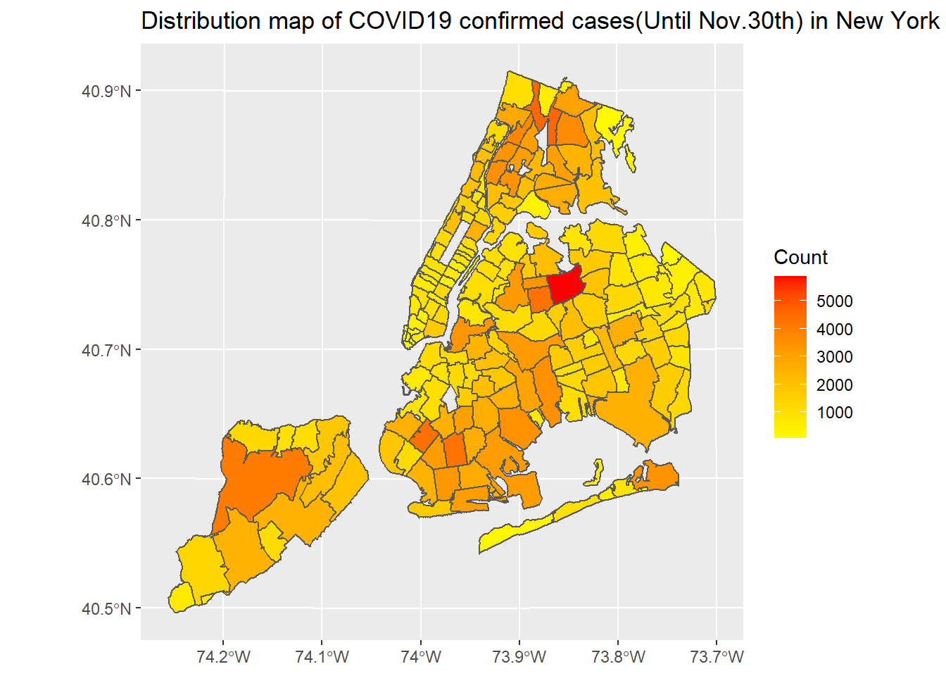
ggplot(nyc_covid) + geom_sf(aes(fill = COVID_DEATH_COUNT)) + scale_fill_gradient2(low = "pink",mid = "purple", high = "blue", midpoint = 225) + labs(title = "Distribution map of COVID19 death cases(Until Nov.30th) in New York City", fill = "Count")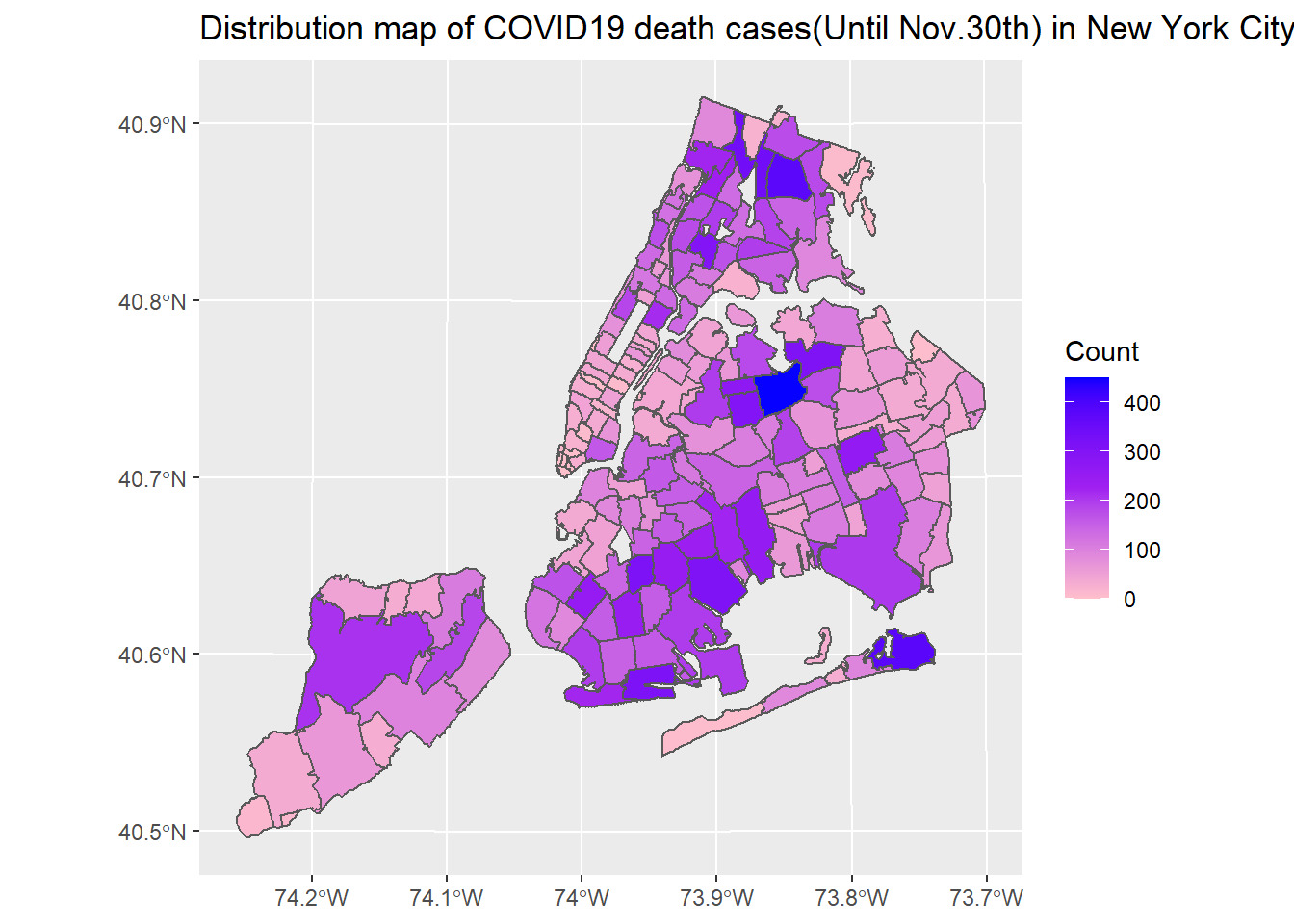
Use an interactive map to show the distribution of COVID19 in New York City
pal <- colorBin("YlOrRd", domain = nyc_covid$COVID_CASE_COUNT)

labels <- sprintf(
  "<strong>%s</strong><br/>%g cases<sup></sup>",
  nyc_covid$NEIGHBORHOOD_NAME, nyc_covid$COVID_CASE_COUNT
) %>% lapply(htmltools::HTML)

nyc_wgs=st_transform(nyc_covid,CRS("+proj=longlat +datum=WGS84"))

leaflet(nyc_wgs) %>%
  setView(lng = -73.98928, lat = 40.75042, zoom = 10) %>%
  addTiles() %>%
  addPolygons(
    fillColor = ~pal(COVID_CASE_COUNT),
    weight = 2,
    opacity = 1,
    color = "white",
    dashArray = "3",
    fillOpacity = 0.7,
    highlight = highlightOptions(
      weight = 5,
      color = "#666",
      dashArray = "",
      fillOpacity = 0.7,
      bringToFront = TRUE),
    label = labels,
    labelOptions = labelOptions(
      style = list("font-weight" = "normal", padding = "3px 8px"),
      textsize = "15px",
      direction = "auto")) %>%
  addLegend(pal = pal, values = ~COVID_CASE_COUNT, opacity = 0.7, title = "COVID19 case count(Until Nov.30th)",
    position = "bottomright")
Plot the old people ratio and median income distribution map in New York City
ggplot(nyc_select) + geom_sf(aes(fill = as.numeric(old_ratio))) + scale_fill_gradient2(low = "purple",mid = "white", high = "red", midpoint = 0.15) + labs(title = "Distribution map of old people ratio in New York City", fill = "old people ratio")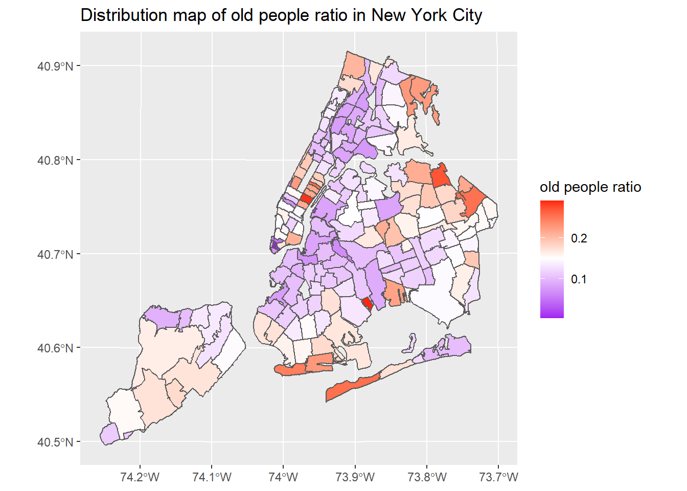
ggplot(nyc_select) + geom_sf(aes(fill = medianincome)) + scale_fill_gradient(low = "white", high = "red") + labs(title = "Distribution map of median income in New York City", fill = "median income")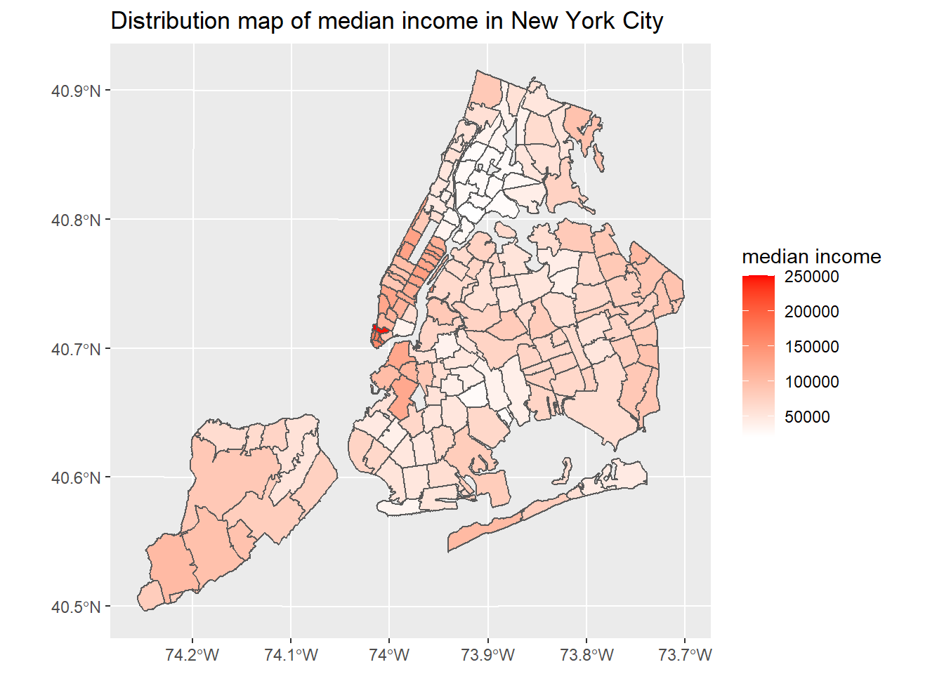
Use heatmap to show the correlation between COVID-19 data and demographic data
ggheatmap +
geom_text(aes(Var2, Var1, label = value), color = "black", size = 4) +
theme(
  axis.title.x = element_blank(),
  axis.title.y = element_blank(),
  panel.grid.major = element_blank(),
  panel.border = element_blank(),
  panel.background = element_blank(),
  axis.ticks = element_blank(),
  legend.justification = c(1, 0),
  legend.position = c(0.6, 0.7),
  legend.direction = "horizontal")+
  guides(fill = guide_colorbar(barwidth = 7, barheight = 1,
                title.position = "top", title.hjust = 0.5))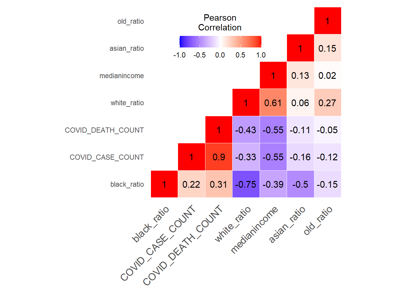
Conclusions
New York City’s COVID-19 confirmed and death cases are located in northern Manhattan, northwest of Queens, southeast of Brooklyn and west of Staten island. The number of COVID-19 cases in New York City has a clear negative correlation with median income. In terms of ethnicity, places with a large proportion of white people are less likely to be infected with COVID-19. There is not much correlation between the proportion of old people and COVID-19 cases.
References
1.Coronavirus in the U.S.: Latest Map and Case Count, https://www.nytimes.com/interactive/2020/us/coronavirus-us-cases.html
2. tidycenses help webist, https://walker-data.com/tidycensus/