Global Prevalence of Depression
Bhavana Poladi
1 Introduction
It is estimated that 792 million people lived with a mental disorder in 2017 which is approximately one in ten people globally. Mental health disorders are conditions that affect a person’s thinking, feeling, mood or behavior. These disorders take many forms including but not limited to depression, anxiety, bipolar disorder, eating disorders(clinical anorexia and bulimia), schizophrenia, substance use disorders and alcohol use disorder. Depression is the second most prevalent mental illness which has affected 264 million people in 2017. Available data shows that mental health disorders are common everywhere in the world and have become a public health problem. Improving awareness, recognition and treatment for these disorders is therefore important. This project aims to investigate the prevalence of depression all over the world and showcase the findings using geospatial visualizations. It is important to measure how common mental illness is, so we can understand its physical, social and financial impact - and so we can show that no one is alone. These numbers are also powerful tools for raising public awareness, stigma-busting and advocating for better health care.
2 Materials and methods
As part of initial setup, we need to load the required packages. For this project, the following packages are used
2.0.1 Load the required packages
2.0.2 Data import and pre-processing
All the data required for this project is taken from Our World in Data. A total of three datasets related to depression are used. The first dataset contains information about the prevalence of depressive disorders in different regions of the world. The second and third datasets contains information on the world-wide prevalence of depressive disorders with to gender and age, respectively. All the datasets contain information from 1990 to 2017.
setwd("~/Desktop/GEO511/geo511-2020-project-BhavanaPoladi")
depression_data <- read.csv("share-with-depression.csv")
dep_malesfemales <- read.csv("prevalence-of-depression-males-vs-females.csv")
dep_age_data <- read.csv("prevalence-of-depression-by-age.csv")
depression_data <- depression_data[-(4145:4172),]
depression_data <- depression_data[-(281:308),]
Some of the region names in the dataset were different from the ones present in the world geojson data, so, the names of such regions should be modified accordingly. The code below shows how that is done.
depression_data <- depression_data %>%
  mutate(Entity = ifelse(Entity == "United States", "United States of America", Entity)) %>%
  mutate(Entity = ifelse(Entity == "Congo", "Republic of Congo", Entity)) %>%
  mutate(Entity = ifelse(Entity == "Democratic Republic of Congo", "Democratic Republic of the Congo", Entity)) %>%
  mutate(Entity = ifelse(Entity == "Tanzania", "United Republic of Tanzania", Entity)) %>%
  mutate(Entity = ifelse(Entity == "Cote d'Ivoire", "Ivory Coast", Entity))
DepData_2017 <- depression_data %>%
  filter(Year == '2017')
3 Results
Firstly, to show the prevalence of Depression across different regions in the world, a choropleth map is created. Since the most recent data available is from 2017, the map is created based on data from 2017 only.
options(highcharter.theme = hc_theme_smpl(tooltip = list(valueDecimals = 2)))
data(worldgeojson, package = "highcharter")
hc <- highchart() %>%
  hc_add_series_map(
    worldgeojson, DepData_2017, value = "Prevalence...Depressive.disorders...Sex..Both...Age..Age.standardized..Percent.", joinBy = c('name','Entity'),
    name = "PrevalencePercent"
  )  %>%
  hc_colorAxis(stops = color_stops()) %>%
  hc_title(text = "Share of population with Depression in 2017") %>%
  hc_subtitle(text = "Percentage of Prevalence") %>%
  hc_add_theme(hc_theme_ggplot2())
hc3.0.1 Top 10 regions in the world with highest prevalence of Depression
top10_depression <- DepData_2017[order(-DepData_2017$Prevalence...Depressive.disorders...Sex..Both...Age..Age.standardized..Percent.),] %>%
  rename(Region = Entity, Percentage = Prevalence...Depressive.disorders...Sex..Both...Age..Age.standardized..Percent.)

top10_dep_countries <- top10_depression[1:10, c(1,4)]
reactable(top10_dep_countries, highlight = TRUE, bordered = TRUE, striped = TRUE)data_anim <- depression_data %>%
filter(Entity == 'Greenland' | Entity == 'Lesotho' | Entity == 'Morocco' | Entity == 'Iran' | Entity == 'Uganda' | Entity == 'United States of America' | Entity == 'Finland' | Entity == 'North America' | Entity == 'Palestine' | Entity == 'Australia') %>%
rename(Region = Entity, Percentage = Prevalence...Depressive.disorders...Sex..Both...Age..Age.standardized..Percent.)
p <- ggplot(data_anim,
aes(x = Percentage, y = Percentage, colour = 'red', size = Percentage)) +
geom_point(show.legend = FALSE, alpha = 0.7) +
scale_color_viridis_d() +
scale_size(range = c(2, 12)) +
scale_x_log10() +
labs(x = "Percent", y = "Prevalence")
anim <- p + facet_wrap(~Region) +
transition_time(Year) +
labs(title = "Year: {frame_time}")
anim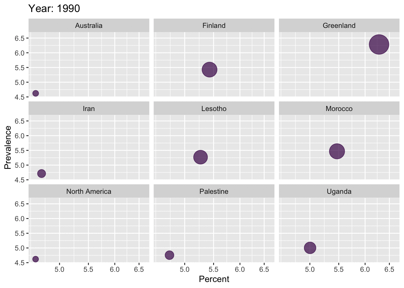
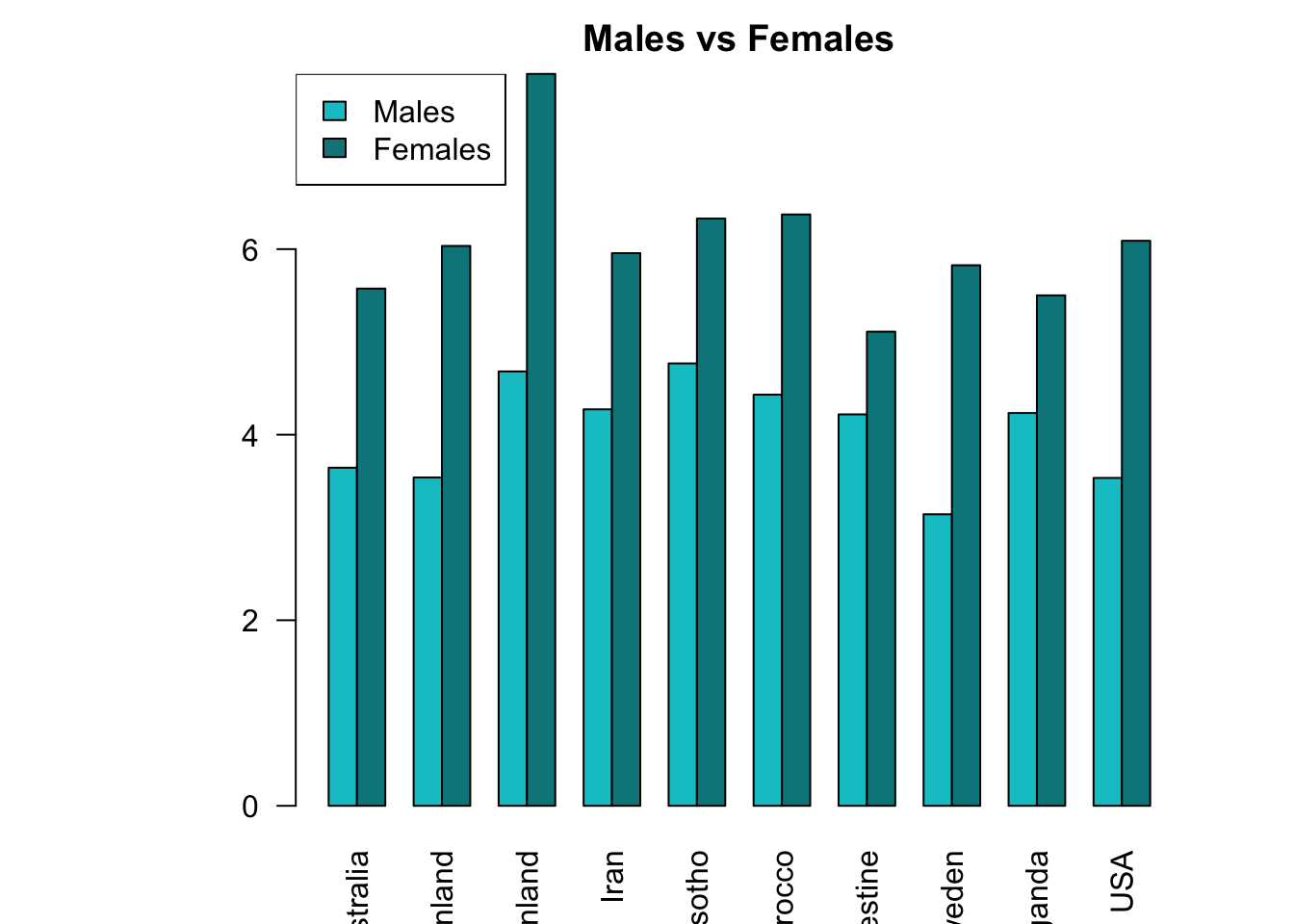
For the 10 regions with the highest prevalence, barplots of gender are plotted.
3.0.2 Barplot showing the gender-distribution of population with Depression in the top 10 regions
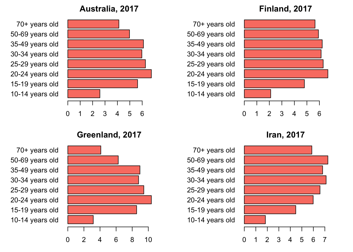
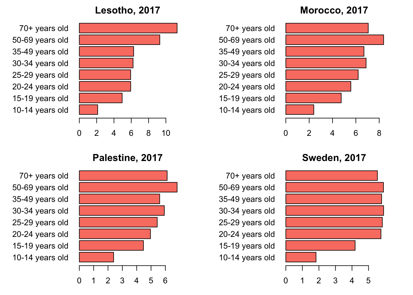
For the 10 regions with the highest prevalence, barplots of age-groups are plotted.
dep_age_data <- read.csv("prevalence-of-depression-by-age.csv")
dep_age_data <- dep_age_data %>%
mutate(Entity = ifelse(Entity == "United States", "United States of America", Entity)) %>%
mutate(Entity = ifelse(Entity == "Congo", "Republic of Congo", Entity)) %>%
mutate(Entity = ifelse(Entity == "Democratic Republic of Congo", "Democratic Republic of the Congo", Entity)) %>%
mutate(Entity = ifelse(Entity == "Tanzania", "United Republic of Tanzania", Entity)) %>%
mutate(Entity = ifelse(Entity == "Cote d'Ivoire", "Ivory Coast", Entity))
top10_age <- dep_age_data %>%
filter(Entity == "Australia" | Entity == "Finland" | Entity == "Greenland"
| Entity == "Iran" | Entity == "Lesotho" | Entity == "Morocco" |
Entity == "Palestine" |Entity == "Uganda"| Entity == "United States of America"
| Entity == "Sweden") %>%
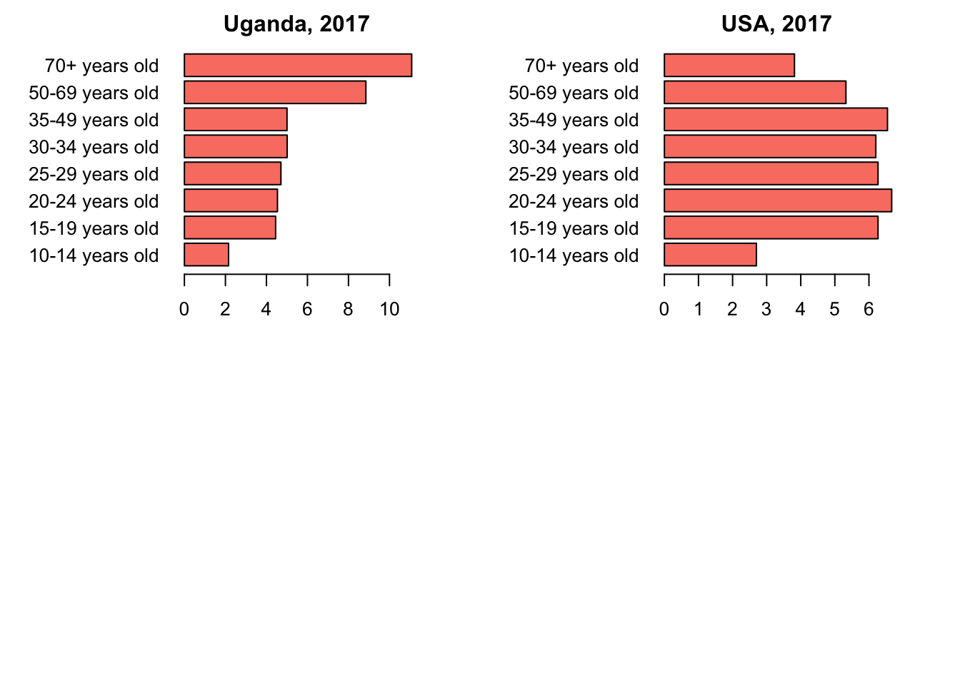
filter(Year == '2017')3.0.3 Barplots showing the age-distribution of population with Depression in the top 10 regions
4 Conclusion
As we saw in the maps above, depression has become prevalent all over the world, over the years. Greenland has the highest percentage of population with Depression. USA is ranked 6th in the entire world, with a percentage of 4.8%. From the gender-distribution plot, it is clear that females are highly affected by depression compared to the male populations. This trend is seen in all the top 10 regions. From the age-distribution barplots, it is observed that the age-groups highly affected by depression are varying in the top 10 regions.
5 References
All sources are cited in a consistent manner